
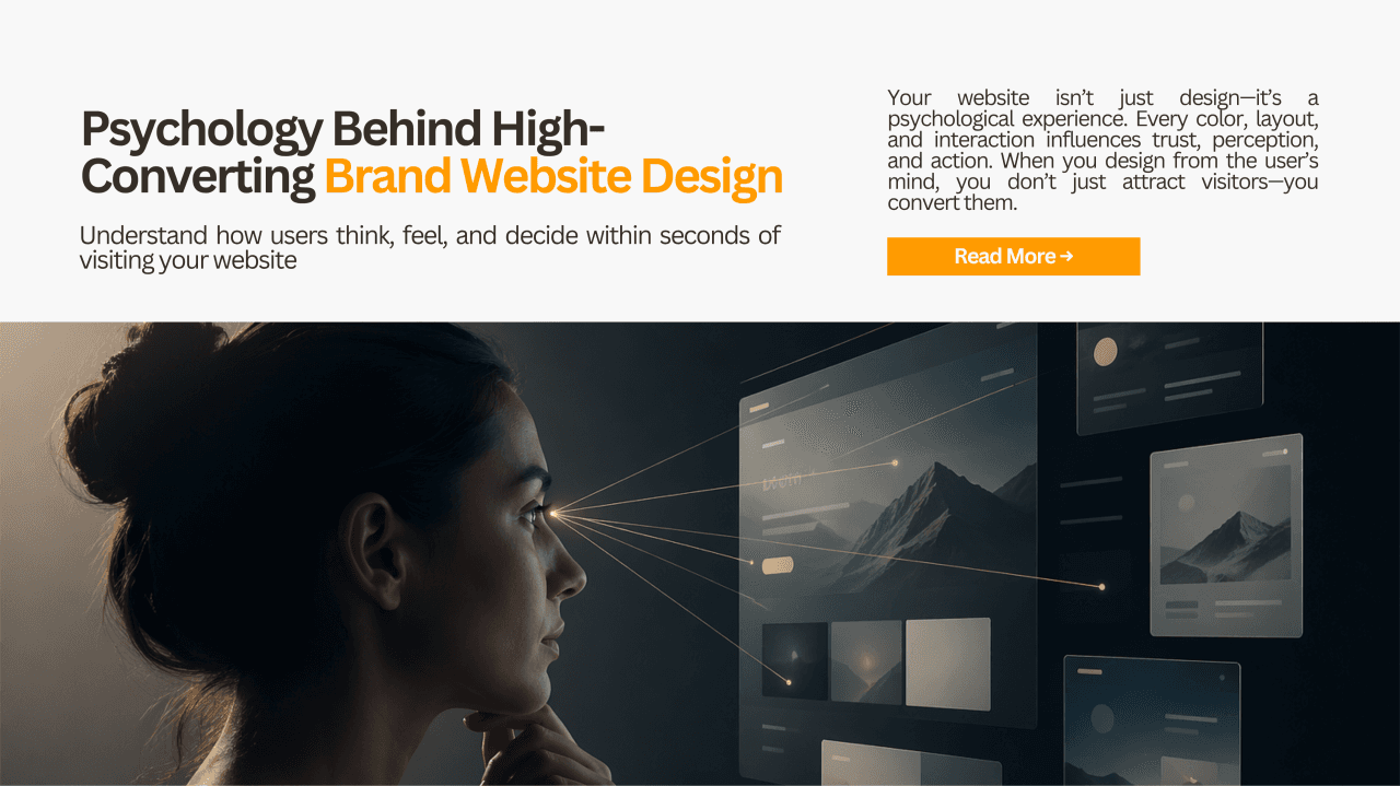

From the User’s Mind: What They Feel, Think, and Decide in Seconds
Introduction: Your Website Is Not a Platform — It’s a Psychological Experience
Most brands still believe a website is about visuals, content, or features.
It’s not.
A website is a decision-making environment where users subconsciously answer three questions within seconds:
- Do I trust this?
- Is this for me?
- Should I act now or leave?
According to a widely cited study by Google, users form an aesthetic judgment about a website in ~50 milliseconds. That’s faster than conscious thought. This means your design is not being evaluated - it is being felt.
This newsletter explores the deep psychology behind brand website design from a user’s point of view, combining behavioral science, cognitive theories, real-world data, and actionable design thinking.
1. The First 5 Seconds: Cognitive Biases Decide Everything
Before logic kicks in, users rely on cognitive shortcuts (heuristics).
Key Psychological Principles:
1. Halo Effect If the design looks premium, users assume:
- The product is high quality
- The company is credible
- The service is reliable
➡️ A clean UI doesn’t just look good - it raises perceived value instantly.
2. Processing Fluency Theory People trust things that are easy to understand.
- Simple layout = Higher trust
- Clear typography = Better retention
- Fast loading = Reduced anxiety
📊 Research Insight: Websites with high visual complexity are perceived as less trustworthy, even if content is strong.
3. Hick’s Law
The more choices you give, the longer users take to decide.
This leads to:
- Decision fatigue
- Drop-offs
- Reduced conversions
Design Insight: Reduce options → Increase action.
2. Trust Is Not Built — It Is Felt Instantly
Trust is the core currency of digital interaction.
What creates instant trust?
Visual Signals
- Consistent branding
- High-quality imagery
- Proper spacing & alignment
Structural Signals
- Clear navigation
- Predictable layout
- Logical information hierarchy
Social Signals
- Testimonials
- Client logos
- Case studies
📊 Stanford Web Credibility Research: 75% of users judge a company’s credibility based on website design alone.
3. Emotional Design: Users Don’t Buy Products — They Buy Feelings
Humans are not rational decision-makers. We are emotion-driven beings who justify decisions with logic later.
The Emotional Layers of Design:
Visceral (First Impression)
- Colors
- Typography
- Imagery
Behavioral (Usability)
- Smooth navigation
- Speed
- Responsiveness
Reflective (Meaning & Identity)
- Brand story
- Values
- Status perception
Color Psychology in Branding
- Blue → Trust, security (banks, SaaS)
- Black/Grey → Premium, authority
- Green → Growth, sustainability
- Red → Urgency, action
But here’s the deeper truth:
👉 Color works only when aligned with brand positioning and user expectation.
4. The Attention Economy: You Are Competing With Everything
Users don’t come to your website focused.
They come:
- Distracted
- Skeptical
- Impatient
Jakob Nielsen’s Eye-Tracking Studies:
Users follow:
- F-pattern scanning (content-heavy pages)
- Z-pattern scanning (landing pages)
What this means:
- Headlines must hit instantly
- CTAs must be visible without effort
- Important content must appear early
5. The Science of Conversion: Why Users Take Action
Conversion is not about persuasion - it’s about reducing psychological friction.
Key Behavioral Theories:
1. Fogg Behavior Model
Behavior = Motivation × Ability × Trigger
If users don’t act:
- Motivation is low
- Task is hard
- Trigger is weak
2. Loss Aversion (Prospect Theory) People fear losing more than they value gaining.
Example:
- “Don’t miss out” works better than “Get this now”
3. Social Proof Principle (Cialdini) Users follow what others are doing.
- “Trusted by 10,000+ users”
- “Top-rated service”
📊 Conversion Rate Optimization Studies: Adding social proof can increase conversions by 15%–34%.
6. Micro-Interactions: The Hidden Layer of Delight
Most brands ignore this — but this is where modern UX wins.
Micro-interactions:
- Button hover feedback
- Smooth transitions
- Loading animations
These create:
- Perceived speed
- Emotional satisfaction
- Sense of control
👉 Users don’t consciously notice them — but they feel the difference.
7. The Paradox of Minimalism: Less Is More… But Only If Done Right
Minimalism is not about removing elements.
It is about removing cognitive load.
Bad minimalism:
- Empty but confusing
- Aesthetic but unclear
Good minimalism:
- Focused attention
- Clear hierarchy
- Intentional whitespace
8. The Trust-Conversion Framework (Advanced Insight)
From a user psychology standpoint, every website should balance:
1. Clarity
- What is this?
- Who is it for?
2. Credibility
- Can I trust this?
3. Value
- What do I gain?
4. Ease
- How simple is it?
5. Urgency
- Why now?
If any one of these fails → user exits silently
9. Real-World Observation: Why Premium Brands Feel Premium
Brands like Apple, Stripe, or Notion don’t just design websites.
They design:
- Confidence
- Control
- Clarity
Their secret:
- Strong visual hierarchy
- Predictable UX patterns
- Emotional consistency
They remove friction so effectively that users feel:
“This is made for me.”
10. Activity: Audit Your Own Website (User Psychology Lens)
Try this exercise:
Step 1: 5-Second Test
Show your homepage to someone for 5 seconds. Ask:
- What does this brand do?
- Do you trust it?
Step 2: Friction Mapping
Identify:
- Where users hesitate
- Where they drop off
- Where confusion exists
Step 3: Emotional Mapping
Ask: What does the user feel at each section? (Confused / Interested / Trusting / Overwhelmed)
Conclusion: Design for the Mind, Not Just the Eye
The future of website design is not visual innovation.
It is psychological precision.
The brands that win are the ones that understand:
- Users don’t read - they scan
- Users don’t think - they feel
- Users don’t evaluate - they decide instantly
Your website is not a digital asset.
It is a silent conversation happening inside the user’s mind.
Final Thought
If your design does not:
- Reduce doubt
- Build trust
- Guide action
Then no amount of marketing will fix it.
If you’re building or redesigning a brand website:
Start asking not “How does it look?”
But “How does it make the user feel, think, and act?”
This is where real design begins.
— Vishal M
Founder & CEO at Vepzo Design Studio
Continue the Conversation
This article was originally published on LinkedIn.
What are your thoughts on this topic?
I'd love to hear your perspective.